
3 Reasons Why a Good Website Design is Important for Businesses
Small and big businesses alike need to have a website these days. A lot of companies, however, seem to think that having any kind of website is already enough. They choose not to invest in making sure that their website looks good because they assume that as long as their target market can find them […]
Why a compelling website design is a must for the success of your business
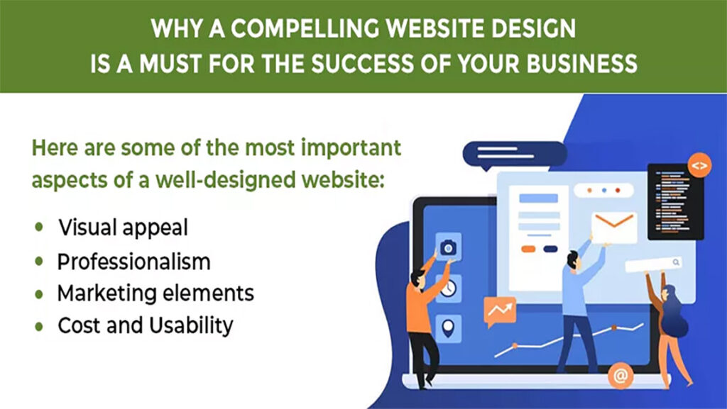
Many entrepreneurs often cut corners when designing their websites while planning for their company’s digital presence. This can be due to various reasons. Costs involved in website designing and hosting are one of the main reasons that prompt business owners to postpone the launch of a professional website. Often, they also get the design done […]
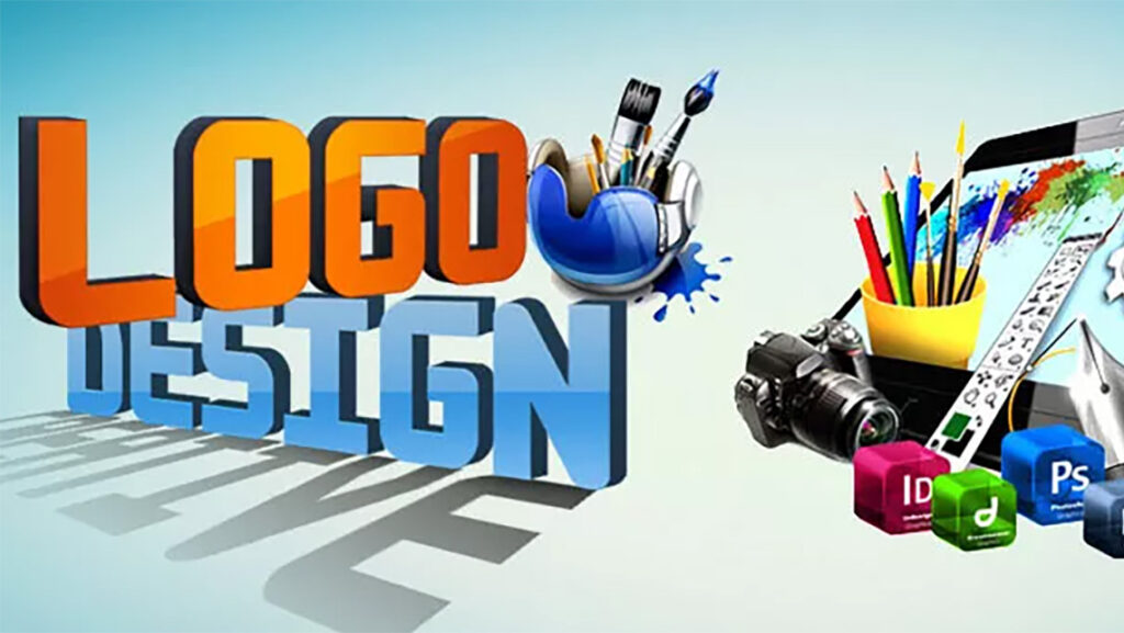
Making an Eye-Catching Logo and Design Your Website
A company can be recognized not only by its name but by a unique symbol of its own, and that can cause a very long impression on the memory of the viewer? Yes, it is the logo of the company. The logos of businesses are how most of the brands are now remembered. Having a […]
Design a unique and attractive Landing Page Through Tools
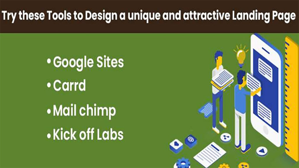
Landing page- a perfect platform for any online-based business. Different businesses adopt different landing page strategies in order to attract potential clients. The majority of the firms opt to collect the email address of the visitors from the landing page itself. In the long run, it helps the brand to reach a larger audience through […]
Latest Web Design Trends – An Ultimate Guide For Web Designers
Are you looking to design a cutting-edge website that supports to achieve all your business mission and vision? If yes, you have to follow the strategy that is advance in today’s world and enables you to create a website apart from others. This strategy eliminates the trends of traditional years and follows the updated tools […]
2017’s Logo Trends To Transform Your Brand Identity
Logos are small identity images that appear on your business website. They actually depict the uniqueness of your brand or organization. To mark a successful presence an online website, make sure you include a relevant and superior logo that somehow depicts your services or products. In other words, it is a visual mark of your […]
Tips to Improve Your Website’s Usability

Modern website users are a little complex. They expect more! They don’t want any poor quality content, broken links and static graphics. No matter whether you are designing, maintaining or updating your website, usability should be the major factor. Planning and testing are the critical aspects to improve a website’s usability. Only with thorough planning […]
6 Must Have Characteristics of a Good Web Designer

With growing Internet needs, consumers and Internet marketing has also increased. This has made many corporates eager to have their own websites. The positive aspect is that if the web is flooded with billions of sites then, there are also a huge number of consumers out there worldwide. If you are passionate for making your […]
2016’s Latest Web Design Trends that Turns Eyes
An impressive website will surely help to increase the visitors on your site. In 2016, various web trends are followed which can help you develop a responsive website. Trends for developing site changes from time to time. Its not worthy to keep waiting for a new trend and aesthetic design. If you are designing a […]
Does Your Website Fails To Load Quickly? Check Out These Possible Reasons for It
There cannot be a bigger shock for the developers and owners to know that their website fails to load quickly! After putting in all the time, efforts and money, a website is prepared to compete. Post that, one has to bear the expenses of making it more SEO friendly. After doing so much and even […]